Ada Health Rebrand: From Fragile to Built for Trust
Ada already had something rare: a logo with real meaning and depth. What it didn’t yet have was a system strong enough to protect that meaning as the company scaled. This project became about recognising existing equity, understanding the medical and technological environment deeply, and building a disciplined brand structure that could carry trust at scale.
Stepping into Ada felt very different from joining most tech companies. The atmosphere was serious, intellectually sharp, and grounded in medical reality. Doctors, researchers, product teams and engineers were building something that operated in a highly regulated space. Ada was a symptom checker designed to guide people through their symptoms and support pre-diagnosis and triage decisions. It was not wellness content. It was not lifestyle health. It was medically validated technology with real responsibility attached to it.
Someone explained the product to me early on in a way that framed everything: a doctor can remember a certain number of diagnoses, while Ada can remember thousands. That sentence captured both the ambition and the sensitivity of the brand. Technology supporting medicine. A medical brain working at scale. And when your promise sits in that space, branding becomes inseparable from credibility.
At the time, the brand system did not yet reflect that maturity.
The early brand: strong ingredients, weak structure
There was an existing brand guideline when I arrived. It was concise, visually clean, and technically correct. Around nine pages covering logo usage, colour palette, typography and some application examples. It was not poorly done. It was simply too light to guide a fast-growing company.
Light guidelines create interpretation. Interpretation creates variation. Variation eventually erodes recognisability.
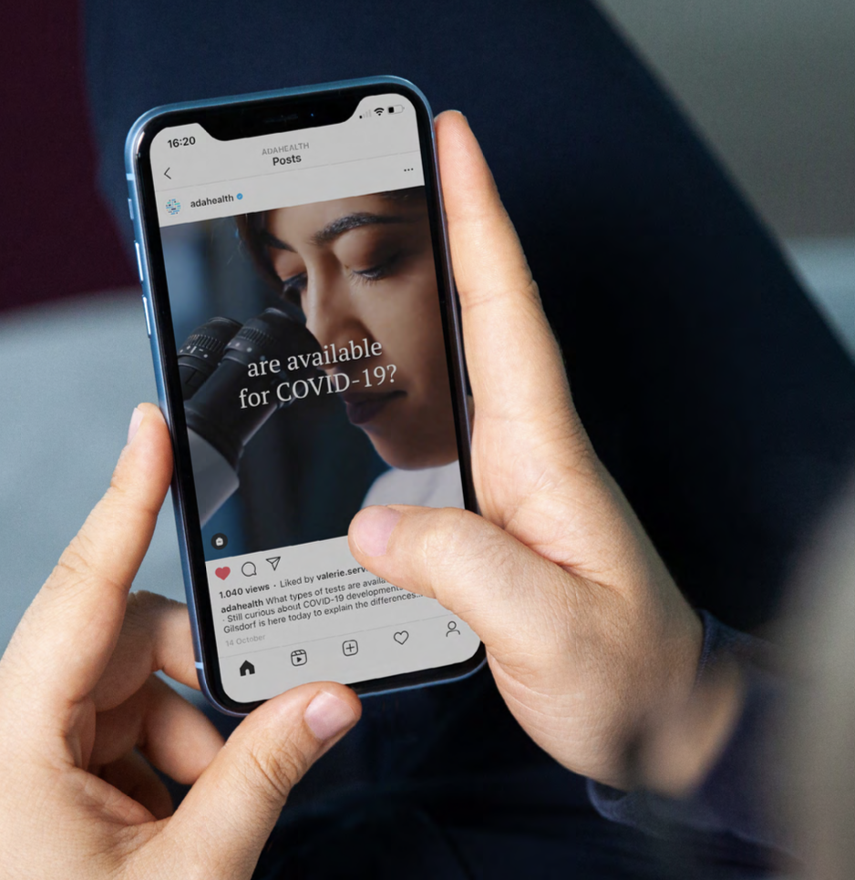
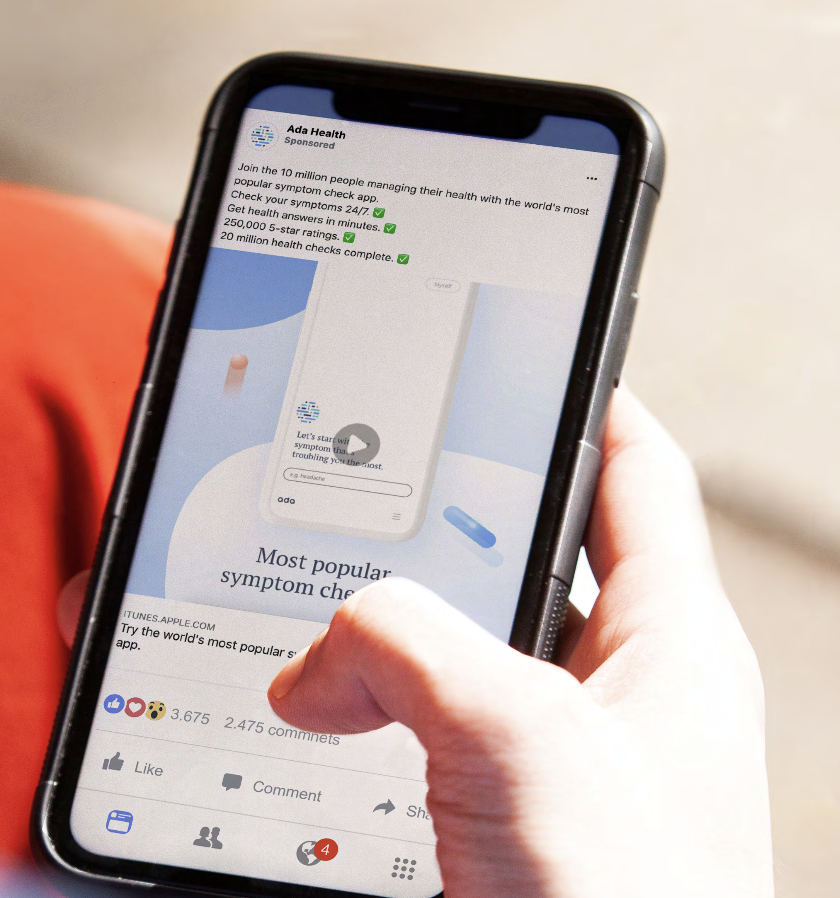
As marketing output increased, the brand began to feel inconsistent across touchpoints. Colours shifted subtly. Layout approaches varied. Tone fluctuated. None of it was dramatic, but collectively it weakened perception. In most industries that might be manageable. In healthcare, it is risky. When a health brand looks inconsistent, it subtly undermines trust.
In health tech, perception equals trust
Ada sits at the intersection of science, technology and humanity. That intersection is delicate. Communication must be precise because every claim is regulated. Messaging needs legal validation. Language cannot overpromise. At the same time, the experience must feel reassuring and human because people use symptom checkers when they are uncertain, anxious or vulnerable.
The brand therefore had to carry two energies simultaneously: scientific credibility and emotional intelligence.
Too clinical, and it feels cold.
Too soft, and it feels unreliable.
Finding that balance became the core strategic challenge.
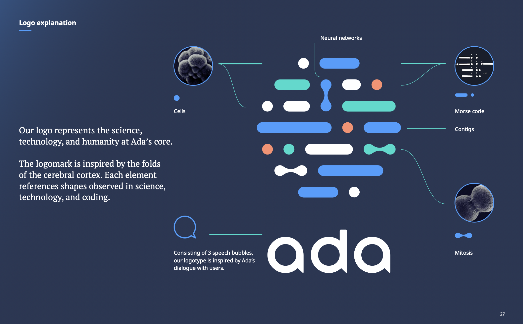
The logo already contained the entire brand world
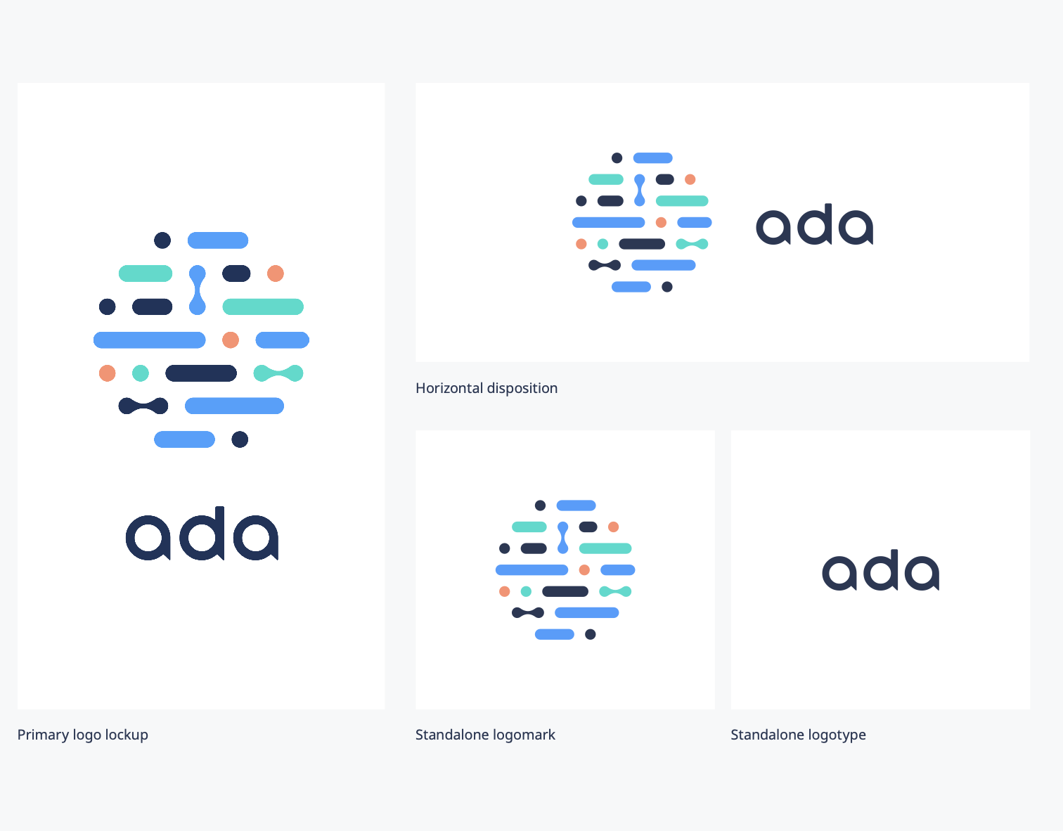
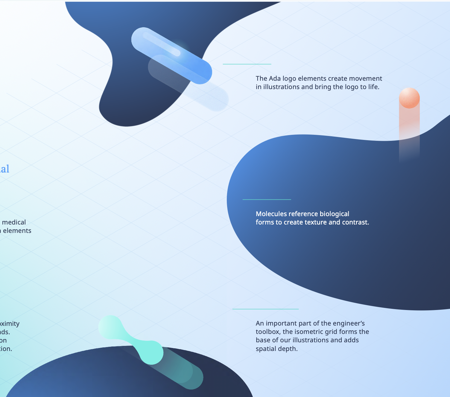
The most fortunate aspect of this project was that Ada already had a genuinely strong logo. It was not just aesthetically pleasing; it was conceptually rich. The icon was composed of modular organic forms, internally referred to as the “genome.” It felt biological, almost like cells seen under a microscope. At the same time, it could be interpreted as connected data points, networks, signals. Some even saw Morse code in it, which subtly reinforced the technological dimension of the company.
The typography carried meaning as well. The A shapes in “Ada” felt conversational, almost like speech bubbles, which aligned beautifully with the product experience. Ada interacts with users through dialogue. It guides through questions. It listens.
The logo was not just a symbol. It was a narrative in compressed form.
For that reason, replacing it was never the objective. The objective was to strengthen it and build a coherent system around it.
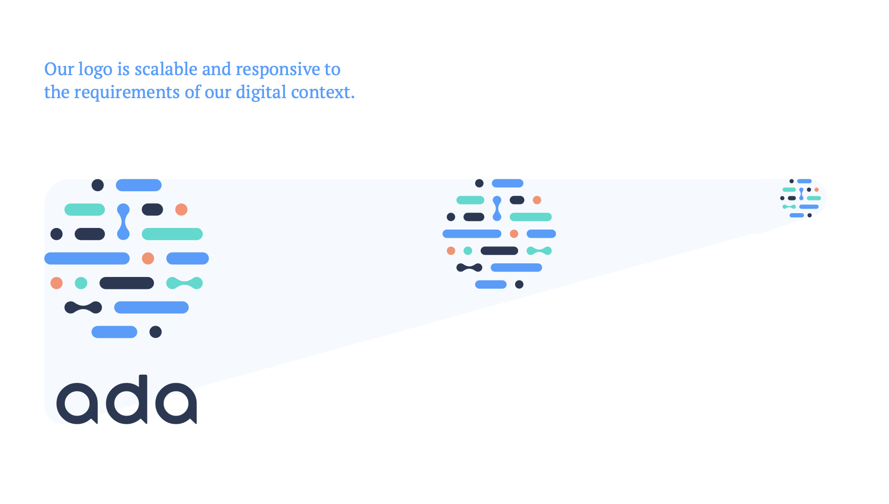
Strengthening the foundations
Although conceptually strong, the logo was not functioning optimally in practice. The construction required refinement and rebalancing to ensure it reproduced consistently across formats. More importantly, the logotype was often being used in isolation without the icon, which gradually diluted recognisability.
The icon was the distinctive asset. Separating it from the wordmark weakened the visual signature.
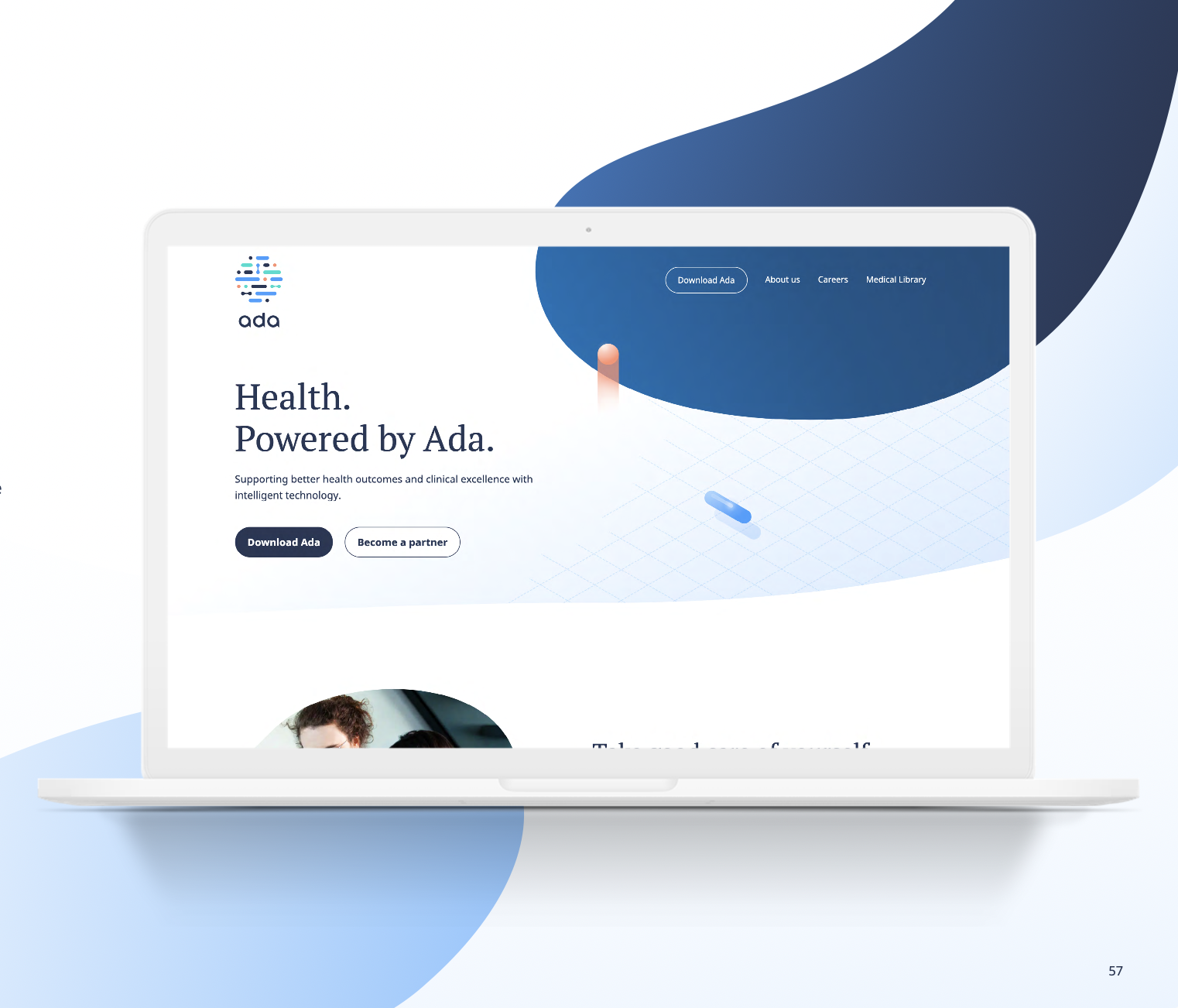
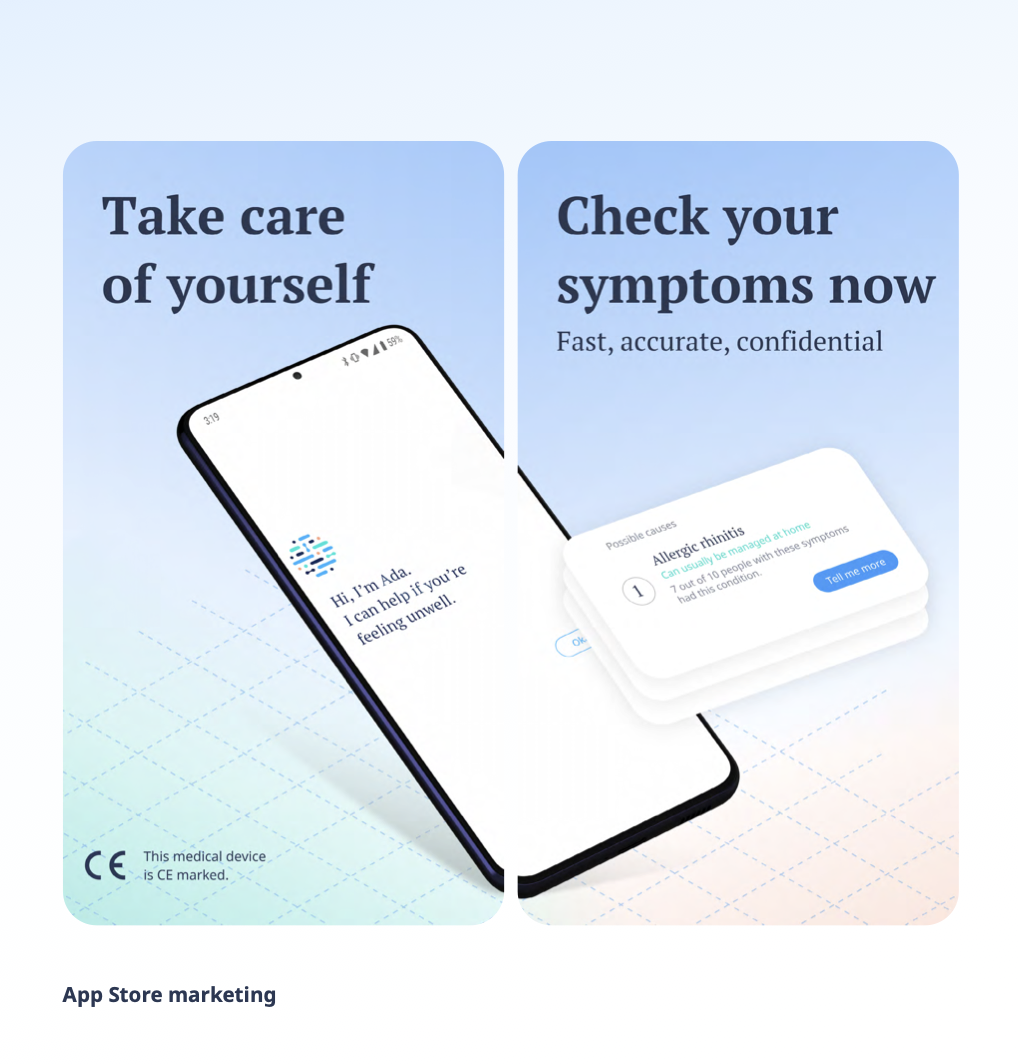
We refined the geometry, improved the balance, and established icon plus wordmark as the primary lockup. At the same time, we built a scalable approach for digital environments. Instead of shrinking the full lockup indiscriminately, we created a reduced icon version designed for app icons, favicons and constrained digital spaces. The system became flexible without losing cohesion.
This was not reinvention. It was structural reinforcement.
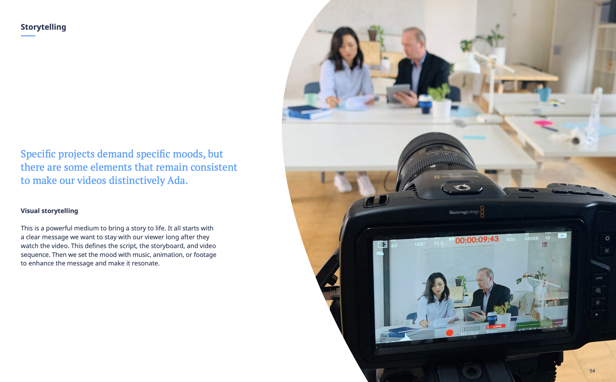
Bringing the identity to life through motion
The next step was to explore motion. The shapes within the icon naturally suggested movement. They could connect, separate, pulse and reorganise. That movement mirrored what Ada actually does: it processes symptoms, identifies patterns, and builds possible pathways.
We developed a motion language derived directly from the logo elements. The result felt scientific and intelligent rather than decorative. Animation became an extension of meaning rather than an embellishment.
At that point, the brand started to feel alive. Not trendy, not overly stylised, but dynamic and thoughtful.
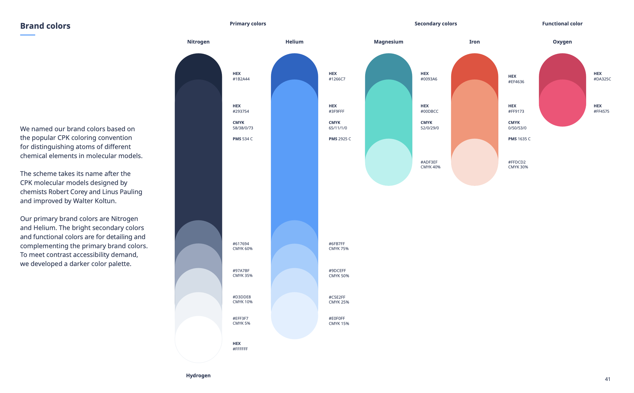
Solving inconsistency through discipline
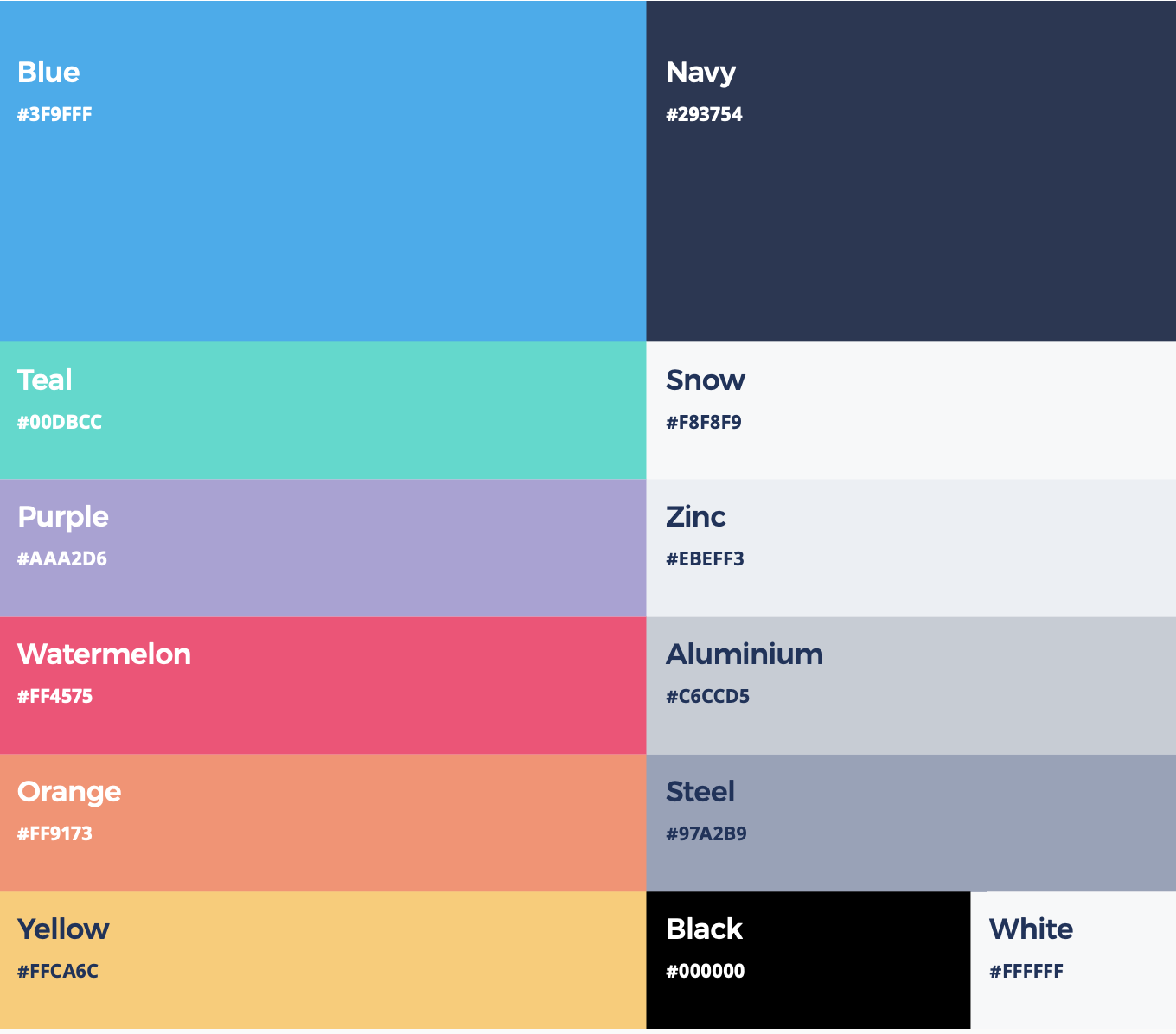
As we audited marketing assets, the underlying issue became clearer. The brand did not lack creativity; it lacked constraints. Colour usage in particular varied widely. Without a clear anchor, different teams interpreted the palette differently.
In response, we established navy blue as the primary anchor colour. It provided stability, seriousness and recognisability. The extended palette was strictly tied to colours derived from the logo. No additional tones were introduced casually. This was a conscious decision to strengthen cohesion.
In healthcare, visual stability reinforces perceived reliability. Discipline was not about limitation; it was about building recognisable authority.
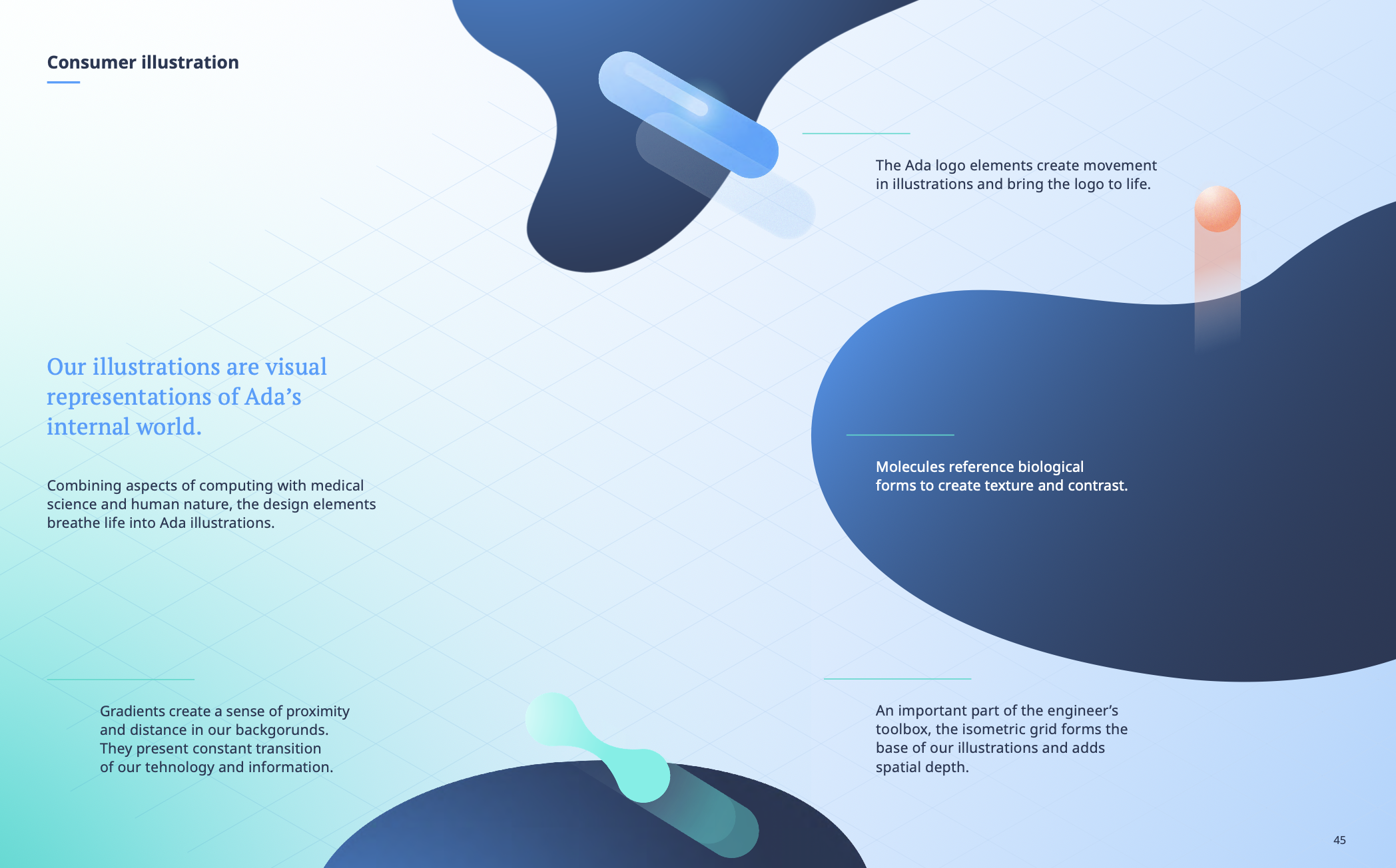
Building a recognisable system beyond the logo
A mature brand should remain recognisable even when the logo is absent. To achieve this, we expanded the identity from the logo’s internal elements.
The shapes evolved into three-dimensional molecular forms that could inhabit layouts. Gradients introduced depth and softness, referencing organic processes and biological environments. Subtle grid systems were integrated to represent engineering logic and technological precision.
The grids symbolised the structured backend.
The molecules represented the human body and living systems.
Together they created a balanced visual language that unified science, technology and care.
Discovery: defining the brand from within
Before finalising the system, we conducted extensive internal discovery. Interviews across departments, surveys exploring values, and workshops designed to articulate the company’s personality and aspirations. The goal was not cosmetic alignment but genuine clarity.
We asked fundamental questions. How should Ada behave? What emotional tone is appropriate for a regulated health product? What values are non-negotiable? How does the company want to be perceived internally and externally?
This process aligned teams and sharpened decision-making. It ensured that the brand system was not imposed from the outside but built from shared understanding.
Interestingly, inspiration came from unexpected places. Medical and science books were scattered throughout the office. We studied real microscopic imagery, biological structures and anatomical references. Those visuals informed texture, illustration and graphic direction. The work became grounded in authentic scientific context rather than abstract design trends.
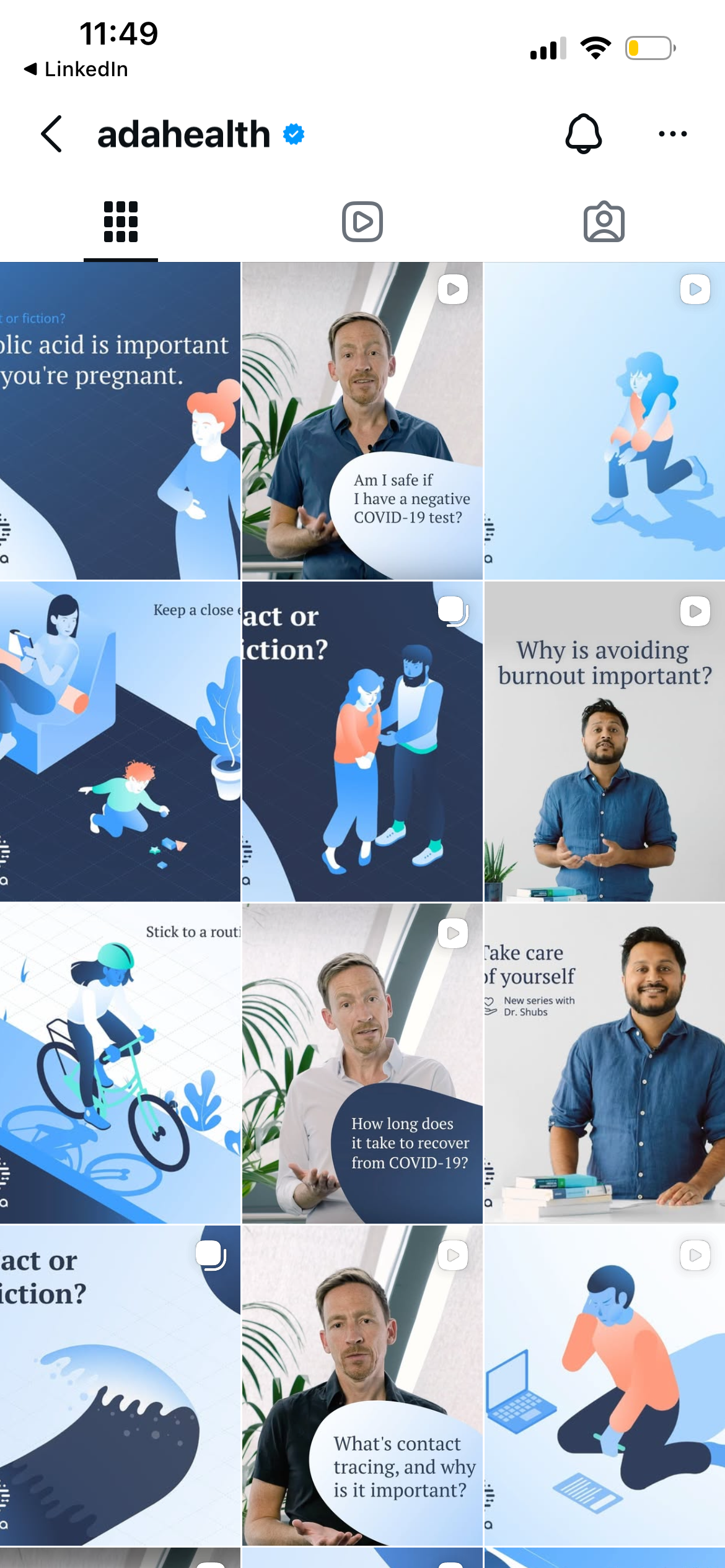
Evolving illustration and photography
Illustration existed but lacked cohesion and warmth. Characters were overly abstract and emotionally distant. In a health context, that distance felt misaligned.
We refined the illustration language to introduce more humanity while preserving clarity and simplicity. Expression was added without compromising professionalism.
Budget constraints required creativity in photography. Instead of outsourcing entirely, we leveraged internal talent. A colleague with strong photography skills led our shoot. Team members participated. Equipment was rented modestly. The resulting imagery felt genuine because it reflected the real people behind the product.
Authenticity became an advantage rather than a compromise.
From a lightweight guideline to a mature brand system
The transformation was not about aesthetics alone. It was about building infrastructure.
The original guideline document was brief and limited in scope. By the end of the project, we had a comprehensive brand book covering logo systems, motion, colour discipline, illustration principles, photography standards, voice guidelines and channel applications.
More importantly, the company gained clarity and confidence. Teams understood how to express Ada consistently. Agencies had clear frameworks. The brand no longer shifted subtly from one output to another.
It became stable. Recognisable. Coherent.


What I learned
This project reinforced an important lesson. Not every brand transformation requires starting over. Sometimes the most strategic decision is to recognise existing strength and build structure around it.
Ada already possessed a meaningful visual asset. The challenge was to translate that potential into a disciplined, scalable system capable of uniting science, technology and humanity under one consistent identity.
In healthcare, consistency is not a stylistic preference.
It is credibility built over time.